My research on general conventions of music videos is
here
My research on conventions of magazine adverts is
here
My research on conventions of digipaks is
here
How my video conforms to general stereotypes/conventions of music videos:
I analysed my video in a similar style to how I analysed existing music videos during my research. This should make parallels between existing music videos and my video more evident especially in terms of themes, semiotics, narrative and the general presentation of the artist.
These are the conventions I identified that I had used in my video:
Zooms - make the artist seem powerful/in control and can mark a change in tone
Long shots - enable audience to see the full set including back up dancers. Reflects the artist monopolizing every opportunity to show off performance skills and impresses the audience.
Tracking shots - show that the artist is the focal point of the video (any tracking in my video was very subtle because I wanted the camera to largely be still).
Musical Editing - In my research I found that Andrew Goodwin stated that this was an important aspect of a music video. It makes the video look professionally put-together. The GIF below shows an example of this: the movements of the dancers, the cross-dissolve cuts and the straight cuts fall on the beats of the music.
Breaking the fourth wall - Here in my video Scarlet turns her head from how she has previously been seen in the silhouetted shots to look directly at the audience, This creates a personal connection and shows an increase in pace in the video since she recognizes the audience are there.
Star personality having aspects of realism (As I found when researching Richard Dyer's Star Theory) - Scarlet puts her hand over her heart suggesting an emotional vulnerability and a more relatable side to her personality.
Relationship between the lyrics and the visuals (as found in Andrew Goodwin's theory):
(lyric: "get close with the lights down low" - it cuts to the silhouetted lighting where the lights are literally turned down low)
(Lyric: "you got my heart" - the dancers all pump their hands over their hearts)
Iconography (as identified in Andrew Goodwin's theory): Scarlet wears red throughout the video and there are elements of red in both the digipak (subtly) and the magazine advert. This music video develops Scarlet's iconography because the colour scheme is so bold, it makes her bold identity very apparent to the audience.
Andrew Goodwin said that videos have identifiable characteristics based on genre so below are listed the ways my video conforms to the pop genre:
Video uses darkness/silhouette as contrast:
(my video)
(From Taylor Swift's video for 'Style')
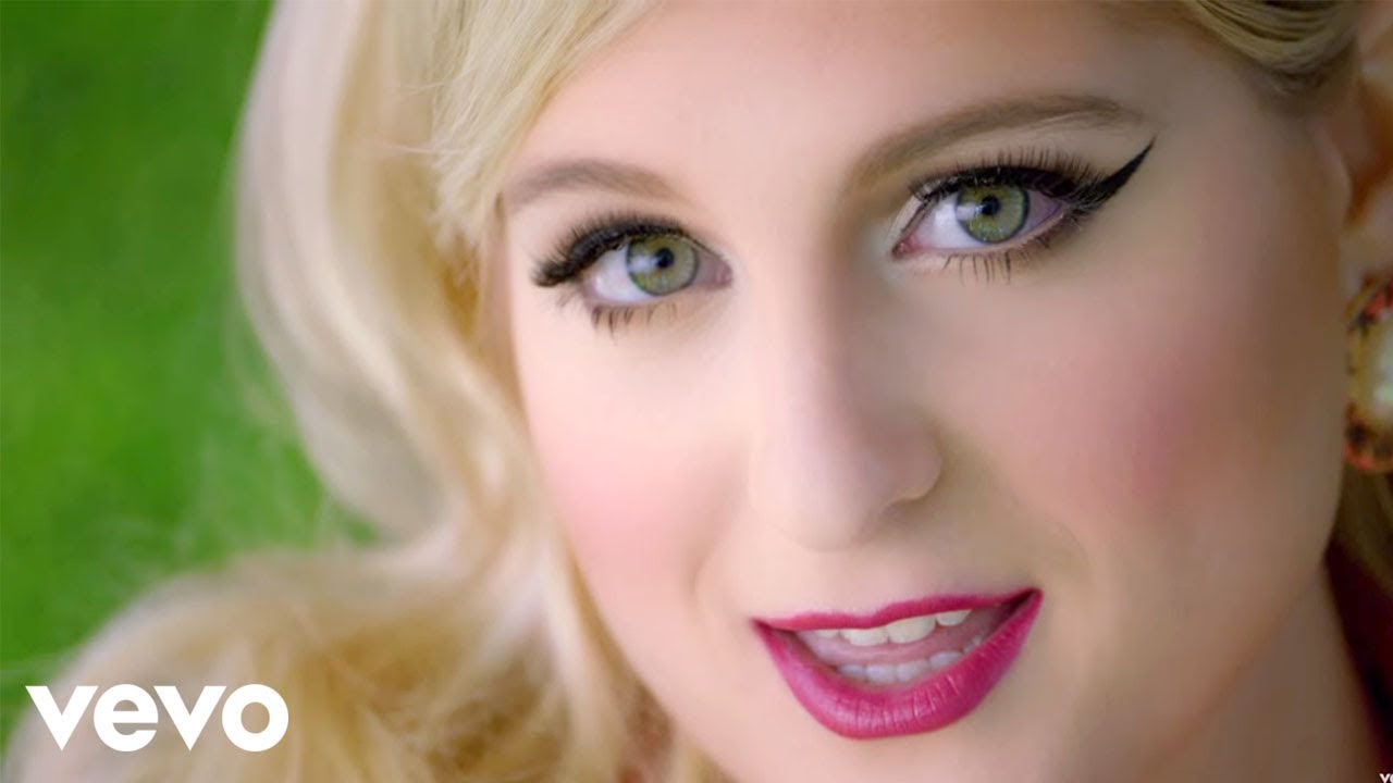
Close ups of artist:
(From my video)
(From Meghan Trainor's video for "Dear Future Husband")
Use of filters especially black and white:
(From my video)
(From Adele's video for "hello")
Idea of music video based around friends: I think that sub-consciously my young target audience would be attracted to this aspect of my video because they might feel like part of the group and that sense of belonging is universally aspired to.
(From my video)
(From One Direction's video for "What Makes You Beautiful)
High key lighting:
(From my video)
(From Rita Ora's video for "I will never let you down")
Artist portrayed as glamorous through costume and makeup:
(From my video)
(From Katy Perry's video for "This is how we do")
Studio setting:
(From my video)
(From Beyonce's video for "Single Ladies") During my research, I looked at Beyonce quite a lot because I wanted Scarlet to promote a similar image to a similar target audience. This meant that during my planning, I looked at Beyonce's existing music videos (Like 'Single Ladies' and 'Love On Top') and planned elements of my music video to be similar. This was my inspiration for the studio setting, dance routine and use of long shots.
Ways my music video challenged stereotypes:
Using multiple locations:
(Justin Bieber's video for 'Confident')
My video ended up (despite my previous intentions) being set in just a studio alone. I think this actually looks better in my video so I'm happy with the decision. Also, there are existing pop music videos which only use one location such as Jessie J's video for 'Who you are' is set in just one room.
(Jessie J: 'Who You Are')
Crane shots:
As demonstrated in Beyonce's video for 'Single Ladies,' many pop music videos use crane shots which look very dynamic and interesting.
My camera work didn't use crane shots. Having a more set camera looks more continuous and makes Scarlet look much more in control because the camera is completely focused on her. Whilst filming I did get footage where the camera moved more (there's a pan shot in one of my earlier drafts) but this footage looked much less professional so I didn't end up using them in my final video. The same applies to other types of camera work e.g. hand-held because I wanted Scarlet to appear in control and steer clear of a sense of chaos.
How my digipak conforms to general stereotypes/conventions of digipak:
I analysed my digipak like I did for existing digipaks as part of my research. (view this research of 3 existing digipaks: 1, 2 and 3) so it is clear how my digipak is similar to existing ones in terms of themes, semiotics, font/text and image:
How my digipak challenges conventions and stereotypes of digipaks:
How my magazine advert conforms conventions and stereotypes of magazine adverts:
I analysed my magazine adverts like I did for existing digipaks as part of my research. (view this research of 3 existing magazine adverts: 1, 2 and 3) so it is clear how my magazine advert is similar to existing ones in terms of themes, semiotics, font/text and image:
How my magazine advert challenges conventions and stereotypes of magazine adverts: